
Power Apps components become much easier to understand when you stop thinking about them as a feature and start thinking about them as a way to avoid repeating yourself. The best example of this is a header. In many apps, I need the same top area again and again: a welcome message, the logged-in user’s name, and maybe the user’s profile image.
That is exactly the kind of thing a component is good at. So in this tutorial, I’m going to keep the focus on components inside a canvas app, and I’ll build the explanation around one realistic example: a reusable Header component that shows “Welcome” and the logged-in user name on the left side, and on the right side shows the user image and the user name again.
Why I Use Components in Power Apps
When I build Power Apps, I usually notice the same pattern very quickly. I create one screen, then another, and then I end up copying the same controls across both screens. Maybe it is a header, maybe a footer, maybe a filter bar, maybe a popup.
That works at first, but it becomes painful later.
If I manually build the same header on five screens, and then I decide to change the layout, font size, spacing, or colors, I need to update all five versions. That is exactly the kind of repetitive work I try to avoid.
A component solves that problem.
I create the header once, design it properly, and then reuse it wherever I want. If I need to make a change later, I update the component once, and the rest of the app stays consistent.
That is the simplest reason to use components:
- Less duplicate work.
- Cleaner app design.
- Easier maintenance.
- More consistency across screens.
And honestly, that last one matters a lot. Users may not know what a component is, but they do notice when one screen looks slightly different from another.
What Are Components in Power Apps
A component in Power Apps is a reusable building block that can contain controls, formulas, styles, and custom properties. Think of it as a self-contained mini app element that you can design once and use many times.
Instead of placing ten labels, five icons, and a few buttons separately on every screen, I can wrap them into a component and reuse that component wherever needed. That saves time, keeps the design consistent, and makes future changes much easier.
Components are most useful in canvas apps, where you often build reusable UI patterns such as:
- Headers.
- Side navigation.
- Dialog boxes.
- Tabs.
- Cards.
- Status indicators.
- Search bars.
- Date or filter selectors.
The component can contain:
- Labels.
- Icons.
- Images.
- Shapes.
- Buttons.
- Formulas.
- Custom properties.
That last part is important. Custom properties are what make the component flexible. They let me pass different values into the component or get values out of it.
The big idea is simple: build once, reuse everywhere.
Check out Data Table Control in Power Apps Canvas App
Components vs Component Libraries in Power Apps
This is where many people get confused, so I like to keep it very simple.
A component is the reusable object itself.
A component library is a container where components can be stored and reused across multiple apps in Power Apps.
If you only need a reusable element inside one Power Apps app, a local component may be enough. But if you want to reuse that same component in several apps in Power Apps, a component library is usually the better choice.
Here is the practical difference:
| Item | Best for | Main advantage |
|---|---|---|
| Local component | Reuse inside one app | Quick and simple |
| Component library | Reuse across multiple apps | Centralized maintenance |
In real projects, I often start with a local component while designing. Once the pattern proves useful, I move it into a library so I can reuse it across future apps too.
Power Apps Component Example
To make this practical, let’s use your exact scenario.
I want to create a Header component with this layout:
Left side
- Text:
Welcome - Logged-in user name
Right side
- Logged-in user image
So visually it might look like this:
Left side:
Welcome {User Name}
Right side: [User Photo]
This is actually a very useful example because it covers the most common things people want to do with components:
- Reuse a header on multiple screens.
- Show logged-in user information.
- Control layout inside a component.
- Keep the app clean and consistent.
And the nice part is that Power Apps already gives us the user details we need through the User() function.
The most useful values are:
User().FullNameUser().EmailUser().Image
That means I can use the current user’s name and image directly inside the component without making the app complicated.
When I would use a component for this header
This header is a perfect case for a component if:
- I want the same header on multiple screens.
- I want the same look and spacing everywhere.
- I may change the design later.
- I want a cleaner structure in the app.
If the app has only one screen and the header will never be reused, I could build it directly on the screen. But in most real-world apps, especially business apps, the header appears repeatedly.
Examples:
- Home screen.
- Dashboard screen.
- Request form screen.
- Approval screen.
- Details screen.
If the same header appears in these places, I almost always turn it into a component.
What this header component should contain
Before building any component, I like to decide what belongs inside it.
For this header, I would include:
- A background shape, usually a rectangle or container.
- A label for “Welcome”.
- A label for the user’s full name on the left side.
- An image control for the user’s photo on the right side.
You can keep it simple at first. The point is not to make the header fancy. The point is to make it reusable.
A clean header is usually better than an overloaded one.
Step-by-step: Create the Header component
Now let’s build it.
Step 1: Open your canvas app
Open your app in Power Apps Studio. Here, I have created a responsive Canvas app.
Step 2: Make sure components are available
In most apps, components are available by default. If you don’t see the Components area, check the app settings and confirm components are enabled.
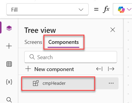
Step 3: Create a new component
In the tree view, create a new component.
I would rename it immediately to something meaningful, such as:
cmpHeadercmpAppHeadercmpUserHeader
I prefer names that clearly tell me what the component does.
For this example, I’ll use cmpHeader. You can see the screenshot below. I have created a component.
Step 4: Set the size
Set the component width and height.
A common starting point could be:
- Width:
App.Width - Height:
80or90
If I want the header to stretch across the app, using App.Width is usually a good option.
Optionally, you can set a background color for the header using the Fill property. I chose a dark blue color for the header component background.
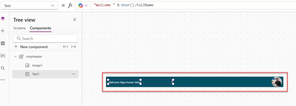
Step 5: Add the “Welcome” label
Insert a label on the left side.
Set the Text property to:
"Welcome" & User().FullName
Here, User().FullName gives the logged-in user’s full name.
Here, I used the Font color property to change the font color to white.
Step 6: Add the user image on the right
Insert an Image control on the right side.
Set its Image property to:
User().Image
This shows the logged-in user’s profile image, as long as it is available in Microsoft 365.
Here, I adjusted the X property as:
Parent.Width-Self.Width-5Then make the size to 80 * 80.
If you want to give the image a rounded look, change the Border radius to 50.
You can see the screenshot below of how the header component looks:
At this stage, the component is already functional. And we can use it on our screens.
Read Set Control Value in Button Click on Power Apps
How to Use the Component on a Power Apps Screen
Now, let me show you how to use the component on a Power Apps screen.
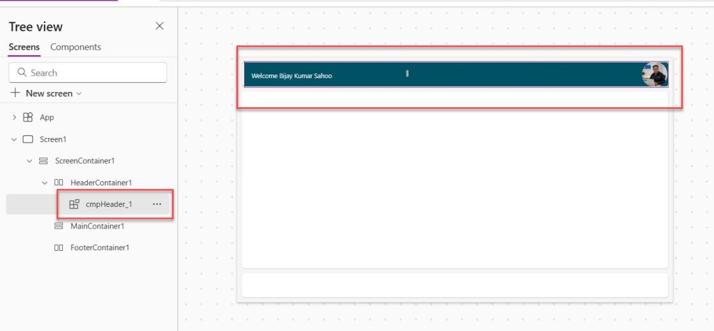
- Open the screen where you want to add the component. In our case, I want to add the component to the header container.
- Click the + icon, then under the Custom category, select the component, as shown in the screenshot below.
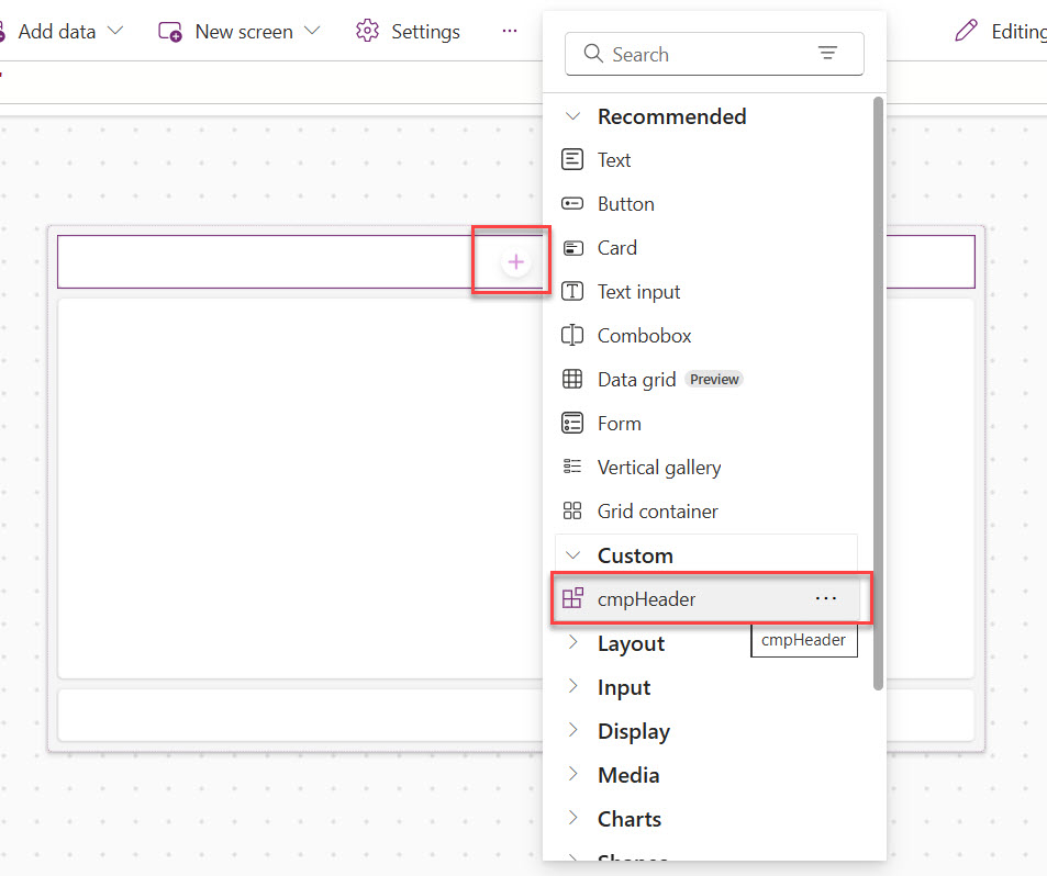
- Once you have added successfully, you can see the header component appears as below. In the same way, you can add the component to other screens also.
- You can also adjust the width if it overlaps, like the Width property as App.Width-40
This is how to create and use components in Power Apps.
Power Apps Component Properties
The real power of Power Apps components comes from custom properties. These allow the parent app and the component to communicate with each other.
Component properties are what make a component flexible.
Without properties, a component is mostly fixed.
With properties, a component becomes reusable in different ways.
There are three property types a beginner should know:
- Input properties
- Output properties
- Behavior properties
Let me explain each one simply.
Input Properties
An input property is a value that goes into the component.
In simple words, the screen gives something to the component.
For example:
- A greeting text
- A title
- A color
- A true/false value
- A name
- An image
So if I want the header to show different greetings on different screens, I should not hardcode “Welcome” forever. Instead, I can create an input property.
Example
Suppose I create an input property called:
GreetingText
Now, instead of setting the label text to:
"Welcome"
I can set it to:
cmpHeader.GreetingText
Then from one screen I can pass:
"Welcome"
And from another screen I can pass:
"Hello"
Same component, different text.
Where to Create an Input Property
Here is the exact flow:
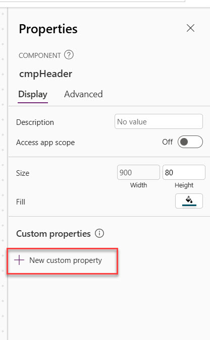
- Select the component itself, not a label or image inside it. Go to the option for custom properties. Here is the screenshot for your reference.
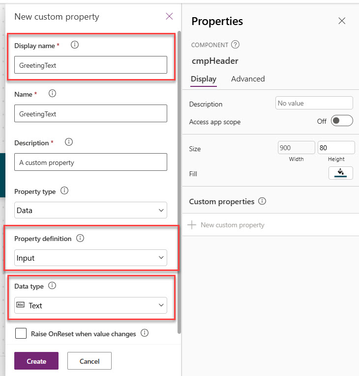
- Click New custom property. Enter the property name, such as GreetingText.
- Choose Input as the property type.
- Choose the data type, such as Text. Save it. Here is the screenshot for your reference.
The property is now available for the component.
For this header example, you can add more useful input properties:
GreetingText– TextHeaderFillColor– ColorHeaderTextColor– ColorShowUserPhoto– Boolean
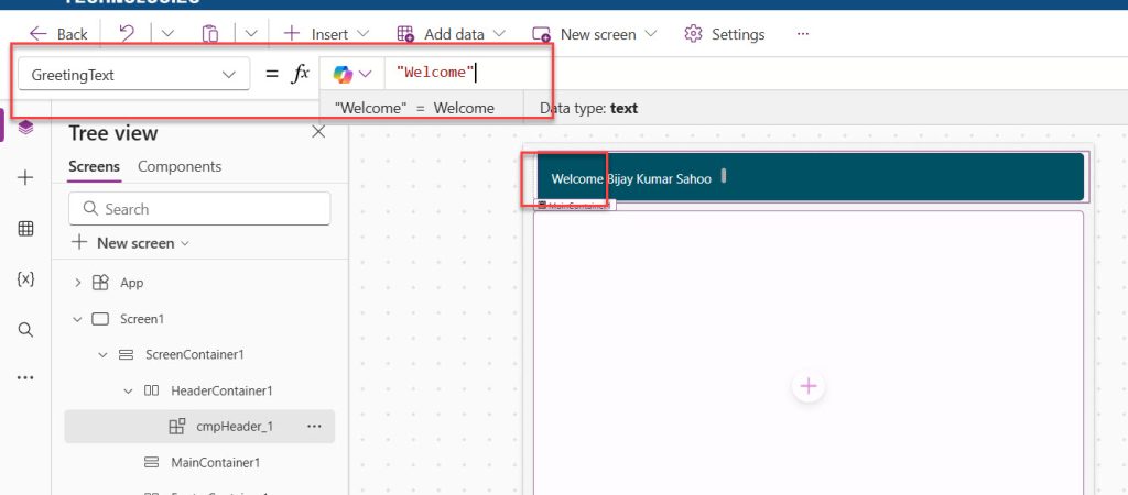
Now, we need to change the greeting message. In the same component, select the Text label and change the Text property to this:
Parent.GreetingText&" " & User().FullName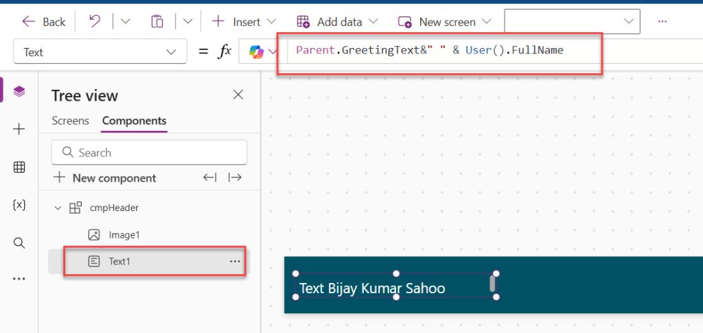
- Now, go to the screen where you have used the component, and change the GreetingText property to “Welcome”. Now, you can see how it appears below:
- Now, you can see I have added two components, and you can see I can give different GreetingText. Here is a screenshot for your reference.

This is how to use the input component properties in Power Apps.
Output Properties
An output property is a value that comes out of the component.
In simple terms, the component returns something to the screen.
This is useful when something happens inside the component, and the screen needs that result.
For example:
- A text entered inside the component
- A selected item
- A chosen tab
- A value calculated inside the component
A very simple way to understand it
If input means:
“Screen gives data to component”
Then output means:
“Component gives data back to screen”
Example output property idea
Suppose the component had a search box.
Then I could create an output property called:
SearchText
And return the text entered in the text input.
That way, the parent screen can use:
cmpHeader.SearchText
to filter a Power Apps gallery.
Where to create an output property
- Select the component.
- Go to Custom properties.
- Click New custom property.
- Give it a name like SearchText.
- Choose Output.
- Choose the data type, such as Text.
- Save it.
Then link that property to the control value inside the component.
For a fresher, the easiest way to remember it is:
- Input = screen to component
- Output = component to screen
Behavior Properties
A behavior property is used when the component needs to trigger an action.
This one is slightly different from input and output.
It is not mainly for passing data.
It is for doing something.
For example:
- Clicking a button
- Opening a popup
- Navigating somewhere
- Running logic on select
A Practical Example
Suppose I add a small icon in the header for profile settings.
When the user clicks it, I want the parent screen to decide what should happen.
Maybe:
- Open a popup
- Navigate to Profile screen
- Show a menu
In that case, I create a behavior property like:
OnProfileClick
Then I connect that property to the icon’s OnSelect.
So the component handles the click, but the screen decides what action should happen.
Where to create a behavior property
- Select the component.
- Go to Custom properties.
- Click New custom property.
- Name it something like OnProfileClick.
- Choose Behavior or Event, depending on what the studio shows.
- Save it.
Then use that property in the control’s behavior formula.
An easy way to remember behavior properties
If input and output are about data, behavior is about actions.
That is the simplest way to think about it.
Check out Power Apps Concatenate Strings
A Beginner-Friendly Way to Remember All Three Properties
This is the easiest explanation I use:
- Input property = I send something into the component.
- Output property = I get something back from the component.
- Behavior property = I make the component do something.
If you remember just that, you are already in a good place.
A Better Version of This Header with Input Properties
Now let me make the example a little smarter, but still beginner-friendly.
Instead of hardcoding everything, I can add these input properties:
GreetingTextHeaderFillColorHeaderTextColorShowUserPhoto
Then I can use them like this
For the welcome label:
cmpHeader.GreetingText
For the background fill:
cmpHeader.HeaderFillColor
For label text color:
cmpHeader.HeaderTextColor
For the image visibility:
cmpHeader.ShowUserPhoto
Now this same component becomes much more flexible.
On one screen, I can say:
- GreetingText = “Welcome”
On another screen:
- GreetingText = “Hello”
And I still use the same component.
That is exactly why custom properties are so important.
How to Use the Component on a Screen
Once the component is ready, here is what a beginner should do next.
- Go to any screen in the app.
- Insert the component.
- Place it at the top of the screen.
- Resize it if needed.
- Set any custom input properties you created.
For example, if you created GreetingText, select the component on the screen and set:
"Welcome"
If you created HeaderFillColor, set it to a color such as:
RGBA(0, 120, 212, 1)
Now the component is working from the screen level.
This is the point where most beginners suddenly understand components. They see that the component is not stuck with one design. It can be reused and configured.
Check out Patch Function in Power Apps
When to Use User() Directly and When to Use Input Properties
This is another question beginners often have.
Use User() directly inside the component when:
- You always want the logged-in user’s details
- You want the simplest setup
- The component is specifically meant for the signed-in user
Use input properties when:
- You want the parent screen to control the values
- You may reuse the component for another person later
- You want more flexibility
For this beginner header example, using User().FullName and User().Image directly is perfectly fine.
It keeps the example simple and easy to follow.
Conclusion
Power Apps components are a simple but powerful way to make your apps cleaner, more reusable, and easier to maintain. In this tutorial, I showed how a Header component can display a welcome message, the logged-in user name, and the user image in a neat layout that you can reuse across screens.
The main idea is to build once and reuse many times. Once you get comfortable with components, you will spend less time repeating the same controls and more time building better app experiences. Do let me know in the comments below if this helps to you.
You may also like the following tutorials:
- Power Apps Modern Checkbox Control
- Power Apps Modern Date Picker with Time
- Sequence Function in Power Apps

I’m Bijay Kumar, a Microsoft Business Application MVP specializing in Power Automate. I have been honored 11 times. With over 18 years in the IT industry, I have practical experience in Power Apps, Power Automate, Power BI, Power Pages, and SharePoint Online. I also co-authored the book Microsoft Power Platform—A Deep Dive. Currently, I develop various apps using Power Apps and automate business processes for many clients in the USA using Power Automate. Read more.