Recently, during one of my Power Apps training sessions, someone asked a very common but important question — “How do I make sure my canvas app looks good on every screen size?” That question pushed me to write this tutorial.
In this tutorial, I will explain how to create a responsive Power Apps canvas app using containers. I will walk you through, step by step, from setting up the app to building a clean, structured form layout with four rows — all using the modern container approach. Even if you are a beginner, you can follow the steps and make it.
Here is what I am going to build:
- Row 1: First Name and Last Name (side by side)
- Row 2: Mobile Number and Email ID (side by side)
- Row 3: Feedback (large, multiline text box)
- Row 4: Submit button (right-aligned)
Let me show you exactly how to do this.
What Is a Responsive Canvas App in Power Apps?
A responsive canvas app is one that automatically adjusts its layout based on the screen size or device on which the user is viewing it. Whether your users are opening the app on a desktop browser, a tablet, or a mobile phone, a responsive app always looks clean and structured.
In older versions of Power Apps, developers used fixed X and Y coordinates to position controls. That approach worked fine when you had a single target screen size, but it broke completely the moment someone opened the app on a different device.
Today, Power Apps provides Auto-Layout Containers — specifically Horizontal Containers and Vertical Containers — that automatically handle positioning. Microsoft also recently introduced Grid Containers, which give you even more control through a row-and-column structure similar to a table. This tutorial will use horizontal and vertical containers, which are the most widely used and fully supported approach right now.
Check out How to Build an App from Scratch using Power Apps?
Why Use Containers Instead of X/Y Positioning?
I see this mistake all the time in apps built by beginners. They drag and drop controls directly on the screen, manually set the X, Y, Width, and Height values, and everything looks fine until the screen size changes — and then the entire layout falls apart.
Here is why containers are better:
- Automatic positioning — you never have to set X and Y for controls inside a container.
- Flexible resizing — containers stretch or shrink with the screen automatically.
- Easier maintenance — you can add, remove, or reorder controls without breaking everything else.
- Cleaner Tree View — your app structure becomes readable and organized.
- Less formula complexity — no need to write complex Width/Height formulas tied to
App.Widthfor every single control.
Microsoft’s own documentation strongly recommends using containers for all modern canvas app layouts. And from my own experience building and training on these apps, containers save you hours of layout troubleshooting.
Read How to Work With Power Apps Variables?
Create a Responsive Power Apps Canvas App Using Containers
Now, follow the steps below to create a responsive Power Apps canvas app using containers.
Step 1: Create a Blank Canvas App
Let me start from scratch. This way, you can follow along easily without any existing configuration getting in the way.
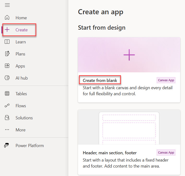
- Open your browser and go to make.powerapps.com.
- On the left navigation pane, click on + Create.
- You will see different options—click Create from Blank option. You can choose even the other canvas app layout options. Here is a screenshot for your reference.
- A dialog box will appear as “Start with a blank canvas“. Choose Responsive.
- Before doing anything, you can click on the Save button to save the app with a name. Give your app a name. I am calling mine the Responsive Feedback Form.
- By default, it creates a screen with a single main screen container; inside that, there are 3 more containers: header, footer, and main. It looks like the screenshot below.
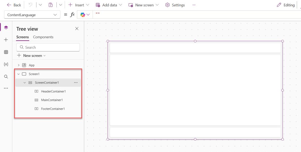
Here, I will keep the main ScreenContainer1 and remove all other containers (Header, Main, and Footer). And rename it to conMain. Then set the properties mentioned in Step 2 below.
Step 2: Add the Main Vertical Container
In case you do not have a main container, follow these steps to add a main vertical container to your canvas app.
Now I am going to add a master container that will hold all four rows of the form. This is a Vertical Container, which means everything inside it will stack from top to bottom.
- In the left sidebar, click the + Insert button (or press the + icon in the toolbar).
- In the search box, type Vertical container and click on it to insert it.
- A container will appear on your screen. Rename it from the Tree View on the left — right-click and rename it to
conMain. - Now, set the following properties for
conMain:
| Property | Value |
|---|---|
| X | 0 |
| Y | 0 |
| Width | Parent.Width |
| Height | Parent.Height |
| Padding Top | 20 |
| Padding Left | 30 |
| Padding Right | 30 |
| Padding Bottom | 20 |
| Gap | 16 |
| Fill | RGBA(245, 245, 250, 1) (a soft off-white background) |
Using Parent.Width and Parent.Height ensures the main container always fills the entire screen, no matter the device. This is your responsive foundation.
Tip for Beginners:
Parentin Power Apps refers to the parent element of the current control. When this container is placed directly on the screen,Parent.Widthequals the screen width. This is how you make things dynamic without hard-coding pixel values.
Step 3: Build Row 1 – First Name and Last Name
Row 1 will have two text input fields side by side: First Name and Last Name. For this, I will use a Horizontal Container nested inside conMain.
Add a Horizontal Container for Row 1
- Select
conMainin the Tree View (click on it to make sure it is selected). - Click + Insert and add a Horizontal container. It will automatically be placed inside
conMainbecause you had it selected. - Rename it to
conRow1. - Set these properties:
| Property | Value |
|---|---|
| Width | Parent.Width |
| Height | 80 |
| Gap | 16 |
| Align (Vertical) | Center |
Add the First Name Label and Text Input
- Select
conRow1. - Click + Insert → Vertical container. Rename it
conFirstName. - Set its Flexible Width to
On(this means it will share the available width equally with the next column). - Inside
conFirstName, insert a Text. Set its Text property to"First Name". SetFontSizeto14,FontWeighttoBold. - Insert a Text input control inside
conFirstName. Rename ittxtFirstName. - Set the text input’s:
- Default:
"Enter your first name" - Width:
Parent.Width - BorderRadius:
8
- Default:
Add the Last Name Label and Text Input
- Select
conRow1again. - Insert another Vertical container, rename it
conLastName. - Inside
conLastName, add a Text control with Text"Last Name", same font settings. - Add a Text input, rename it
txtLastName, with Default as"Enter your last name", and same width and border settings.
Here, both inner containers will automatically split the row 50/50. If the screen gets wider, both columns grow equally. If it gets narrower, they shrink together. No formulas needed.
Step 4: Build Row 2 – Mobile and Email ID
Row 2 follows exactly the same pattern as Row 1. I am going to add another Horizontal Container for this row.
- Select
conMainin the Tree View. - Insert a Horizontal container, rename it
conRow2. - Set the same properties as
conRow1:
| Property | Value |
|---|---|
| Width | Parent.Width |
| Height | 80 |
| Gap | 16 |
Add the Mobile Number Column
- Select
conRow2and insert a Vertical container, rename itconMobile. - Set Flexible Width to
On. - Inside
conMobile, add a Text with Text"Mobile Number". - Add a Text input, rename it
txtMobile, with:- Default:
"Enter your mobile number" - Format: You can leave this as text, but if you want numbers only, set InputTextKind to
Number - Width:
Parent.Width
- Default:
Add the Email ID Column
- Select
conRow2and insert another Vertical container, rename itconEmail. - Set Flexible Width to
On. - Inside
conEmail, add a Label with Text"Email ID". - Add a Text input, rename it
txtEmail, with:- HintText:
"Enter your email address" - Width:
Parent.Width
- HintText:
Pro Tip: For the email field, you can add a simple validation later. On the submit button’s
OnSelect, you can check:If(IsMatch(txtEmail.Text, Match.Email), /* submit logic */, Notify("Please enter a valid email", NotificationType.Error)). I’ll cover this in a future tutorial.
Step 5: Build Row 3 – Feedback (Multiline Text Box)
Row 3 is different from the previous two. Here, I want a single large text box that spans the full width of the form. This is where the user types their feedback, so I need it to be tall and multiline.
- Select
conMainin the Tree View. - Insert a Vertical container, rename it
conRow3. - Set these properties:
| Property | Value |
|---|---|
| Width | Parent.Width |
| Height | 200 |
| Gap | 8 |
- Inside
conRow3, add a Text with Text"Feedback". - Insert a Text input control, rename it
txtFeedback. - Set the following properties on
txtFeedback:
| Property | Value |
|---|---|
| Width | Parent.Width |
| Height | 150 |
| Type | TextInputType.Multiline |
| Default | "Share your feedback here..." |
| BorderRadius | 8 |
The key property here is Type — setting it to TextMode.MultiLine turns the regular single-line text box into a large, multiline input area. When users type a long response, the text wraps inside the box instead of scrolling horizontally.
Beginner Tip: To set the Mode, click on the
txtFeedbackcontrol, go to the Properties panel on the right, and under Mode, choose Multiline from the dropdown. Alternatively, you can typeTextMode.MultiLinein the formula bar when theModeproperty is selected in the property dropdown at the top left.
Step 6: Build Row 4 – Submit Button (Right-Aligned)
The last row is the submit button. The key requirement here is that the button should be right-aligned. This is very easy to achieve inside a Horizontal Container using the Justify property.
- Select
conMainin the Tree View. - Insert a Horizontal container, rename it
conRow4. - Set these properties:
| Property | Value |
|---|---|
| Width | Parent.Width |
| Height | 60 |
| Justify (Horizontal) | End |
| Align (Vertical) | Center |
Setting Justify to End pushes all child controls inside this container to the right side. This is the simplest, cleanest way to right-align a button without any X/Y formulas.
- Inside
conRow4, insert a Button control. Rename itbtnSubmit. - Set these properties:
| Property | Value |
|---|---|
| Text | "Submit" |
| Width | 150 |
| Height | 44 |
| Fill | RGBA(0, 120, 212, 1) (Microsoft blue) |
| Color | White |
| BorderRadius | 8 |
| FontWeight | Bold |
- On the button’s OnSelect property, add a basic notification for now:
Notify("Thank you for your feedback!", NotificationType.Success);
Reset(txtFirstName);
Reset(txtLastName);
Reset(txtMobile);
Reset(txtEmail);
Reset(txtFeedback);
This will show a success message and clear all the fields after the user clicks Submit. Later, you can replace this with a Patch() function to save the data to a SharePoint list or Dataverse table.
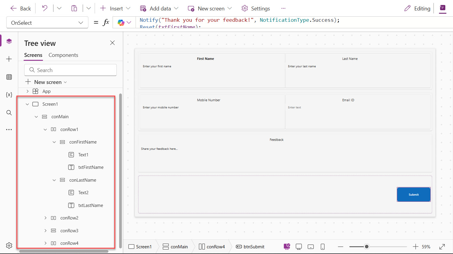
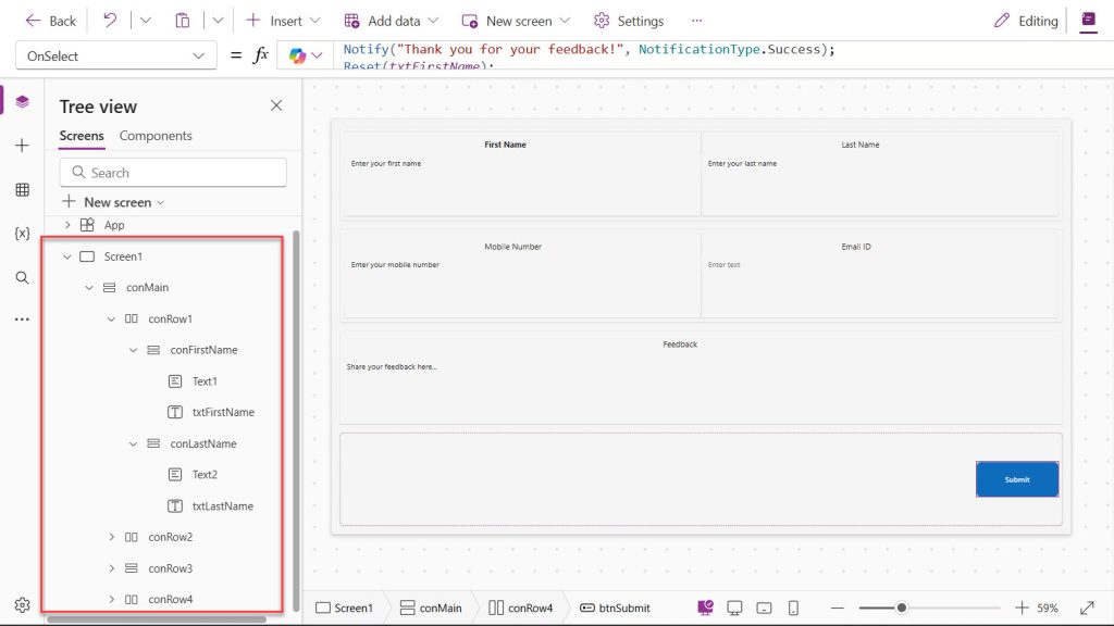
You can see the entire app structure, like in the screenshot below:
Step 7: Style and Polish Your Form
Now that the structure is in place, let me show you a few styling improvements that take this form from basic to professional.
Add a Header Row
Go back to conMain and insert a Label at the very top (before conRow1). Set:
- Text:
"Feedback Form" - FontSize:
24 - FontWeight:
Bold - Color:
RGBA(0, 64, 128, 1) - Width:
Parent.Width
Apply Consistent Text Input Styling
For each of the five text input controls (txtFirstName, txtLastName, txtMobile, txtEmail, txtFeedback), set:
- BorderColor:
RGBA(200, 200, 210, 1) - FocusedBorderColor:
RGBA(0, 120, 212, 1)(the field border turns blue when clicked — a nice UX touch) - Fill:
RGBA(255, 255, 255, 1)(white background) - PaddingLeft:
10 - PaddingTop:
8
Add a Hover Effect to the Button
Select btnSubmit and set the HoverFill property to:
RGBA(0, 90, 170, 1)
This makes the button slightly darker when the user hovers over it, giving it a polished, app-like feel.
Read Create an App from an Excel File in Power Apps
Final App Preview and Container Tree Structure
After completing all the steps, your Tree View should look like this:
Screen1
  └── conMain (Vertical Container)
        ├── lblHeader (Label)
        ├── conRow1 (Horizontal Container)
        │     ├── conFirstName (Vertical Container)
        │     │     ├── lblFirstName (Label)
        │     │     └── txtFirstName (Text Input)
        │     └── conLastName (Vertical Container)
        │           ├── lblLastName (Label)
        │           └── txtLastName (Text Input)
        ├── conRow2 (Horizontal Container)
        │     ├── conMobile (Vertical Container)
        │     │     ├── lblMobile (Label)
        │     │     └── txtMobile (Text Input)
        │     └── conEmail (Vertical Container)
        │           ├── lblEmail (Label)
        │           └── txtEmail (Text Input)
        ├── conRow3 (Vertical Container)
        │     ├── lblFeedback (Label)
        │     └── txtFeedback (Text Input - Multiline)
        └── conRow4 (Horizontal Container)
              └── btnSubmit (Button)
This structure is clean, readable, and — most importantly — fully responsive. When the screen resizes, every container adapts automatically.
Bonus: Connect the Form to a SharePoint List
Since most Power Apps forms are used to collect and store data, let me quickly show you how to connect this form to a SharePoint list.
Create a SharePoint List
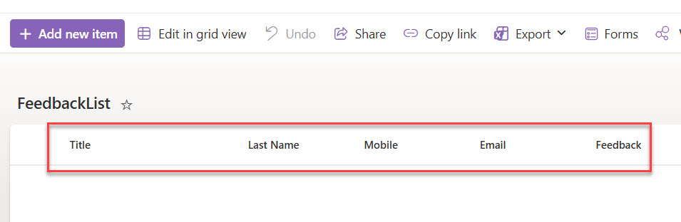
In your SharePoint site, create a list called FeedbackList with the following columns:
| Column Name | Column Type |
|---|---|
| First Name (Title Column) | Text |
| Last Name | Text |
| Mobile | Text |
| Text | |
| Feedback | Multiple lines of text |
You can see what the SharePoint list looks like:
Connect Power Apps to SharePoint
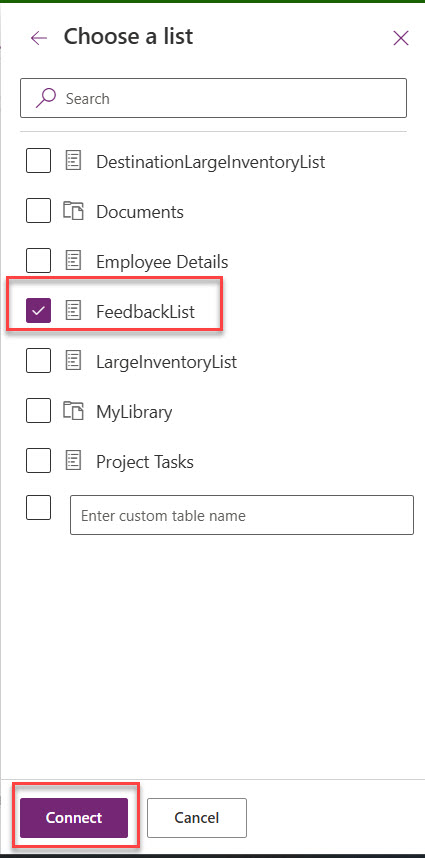
- In the Power Apps studio, click on Data (the database icon on the left sidebar).
- Click + Add data.
- Search for SharePoint and connect to your SharePoint site.
- Select the FeedbackList you just created. Here is a screenshot for your reference.
Update the Submit Button Formula
Replace the current OnSelect formula of btnSubmit with:
Patch(
    FeedbackList,
    Defaults(FeedbackList),
    {
        Title: txtFirstName.Text,
        LastName: txtLastName.Text,
        Mobile: txtMobile.Text,
        Email: txtEmail.Text,
        Feedback: txtFeedback.Text
    }
);
Notify("Your feedback has been submitted successfully!", NotificationType.Success);
Reset(txtFirstName);
Reset(txtLastName);
Reset(txtMobile);
Reset(txtEmail);
Reset(txtFeedback);
The Patch() function creates a new record in your SharePoint list every time the user clicks Submit. The Defaults() function ensures you are always creating a new row rather than overwriting an existing one.
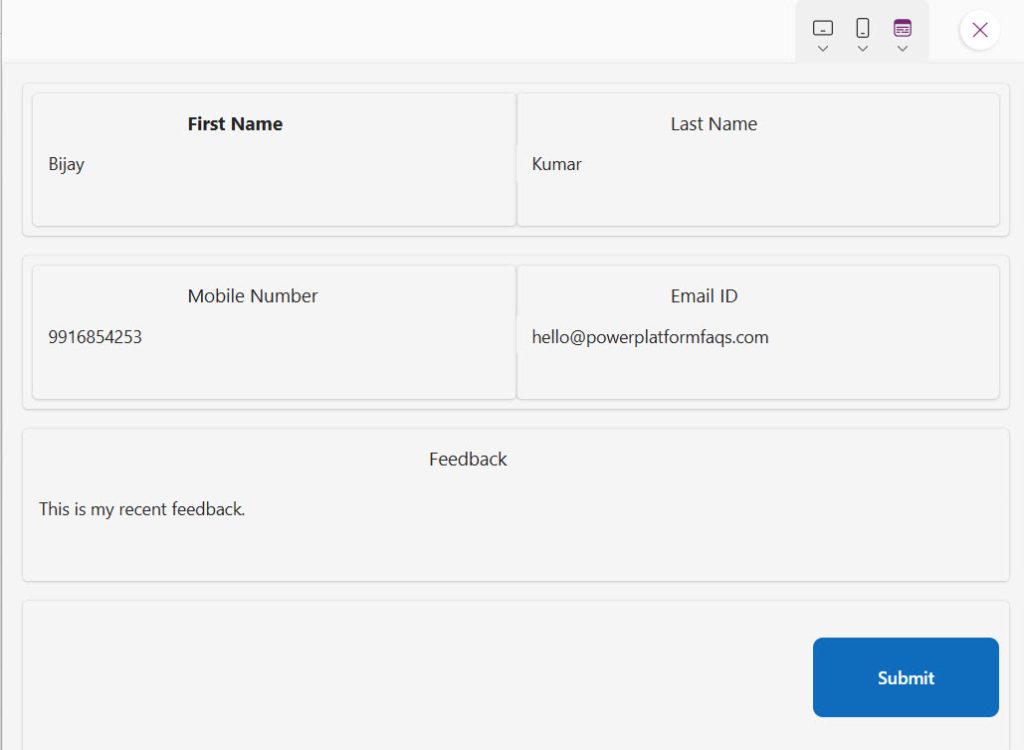
I run the Power Apps and submitted the values like below:
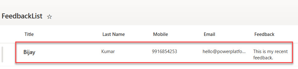
If you will now open the SharePoint list, you can see the feedback saved as below:
Check out Set Control Value in Button Click on Power Apps
Validate the Form Before Submitting in Power Apps
A good form always validates inputs before submission. Here is a simple validation check you can add inside the btnSubmit OnSelect property, before the Patch() call:
If(
    IsBlank(txtFirstName.Text) || IsBlank(txtLastName.Text) || IsBlank(txtEmail.Text),
    Notify("Please fill in all required fields.", NotificationType.Warning),
    // Patch formula goes here
    Patch(
        FeedbackList,
        Defaults(FeedbackList),
        {
            Title: txtFirstName.Text,
            LastName: txtLastName.Text,
            Mobile: txtMobile.Text,
            Email: txtEmail.Text,
            Feedback: txtFeedback.Text
        }
    );
    Notify("Submitted successfully!", NotificationType.Success);
    Reset(txtFirstName);
    Reset(txtLastName);
    Reset(txtMobile);
    Reset(txtEmail);
    Reset(txtFeedback);
)
This checks if First Name, Last Name, or Email is empty before even trying to submit. If any of them are blank, it shows a warning message. Otherwise, it proceeds with the Patch.
Conclusion
In this tutorial, I explained how to create a responsive Power Apps canvas app using containers. Here is a quick summary of what we built:
- Created a blank canvas app with responsive settings enabled
- Built a main vertical container as the full-screen layout foundation
- Used horizontal containers with flexible-width inner columns for Row 1 and Row 2
- Added a multiline feedback text box for Row 3
- Right-aligned a submit button using the
Endjustify property for Row 4 - Styled the form with consistent borders, focus colors, and hover effects
- Connected the form to a SharePoint list using the
Patch()function - Added basic form validation using
IsBlank()
The container-based approach is the right way to build canvas apps in Power Apps. It is cleaner, more maintainable, and your apps will look great on every device without writing hundreds of formulas just to manage positions.
I hope this helped. Let me know in the comments if you have any questions!
You may also like:

Bijay Kumar is a Microsoft MVP in Business Applications with over 18 years of experience in the IT industry and more than 12 years as a Microsoft MVP, recognized for his contributions to the Microsoft community. He is the Founder of TSinfo Technologies and the creator of the popular technology platforms SPGuides.com and EnjoySharePoint.com. Bijay also runs the SPGuides YouTube channel, where he shares practical tutorials on Microsoft 365, SharePoint, Power Platform, and Copilot technologies. Read more.