
Ever built a gallery in Power Apps and noticed it feels flat? Users click around, but nothing tells them an item is clickable until they actually tap it. That lack of feedback makes your app feel unfinished, even if the data behind it works perfectly.
A hover effect is a small visual change — such as a color shift, a shadow, or a slight animation — that occurs when a user hovers over a gallery item. Think of a sales team tracker where each row shows a rep’s name, region, deal amount, and status. When a manager scrolls through that list, a subtle hover highlight helps them quickly spot the row they’re about to click, making the whole app feel more polished and responsive.
In this article, I’ll show you 4 ways to add hover effects to Power Apps gallery items.
I’ll use one consistent example throughout: a Sales Tracker gallery built from a data source with columns SalesRep, Region, Amount, and Status.
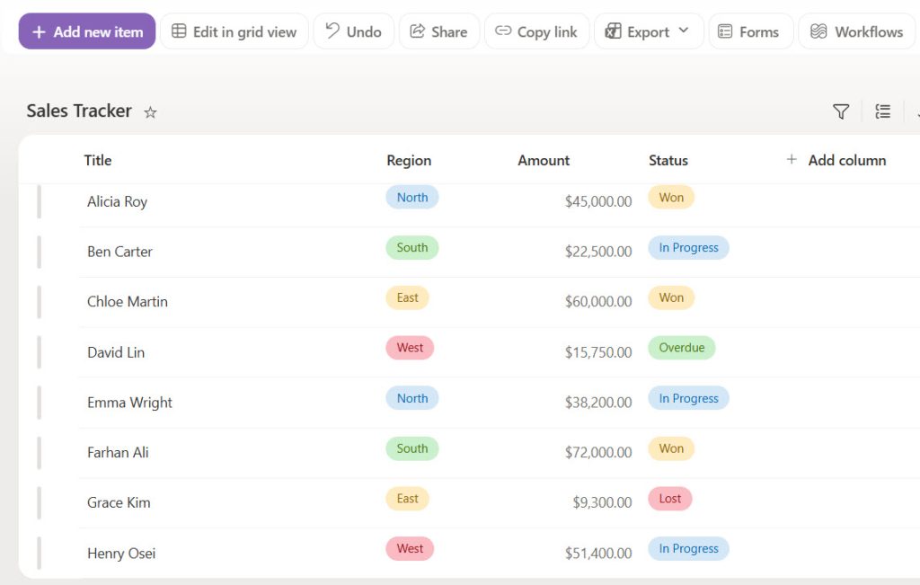
With the table data below, I have created the Sales Tracker list:
| SalesRep | Region | Amount | Status |
|---|---|---|---|
| Alicia Roy | North | 45,000 | Won |
| Ben Carter | South | 22,500 | In Progress |
| Chloe Martin | East | 60,000 | Won |
| David Lin | West | 15,750 | Overdue |
| Emma Wright | North | 38,200 | In Progress |
| Farhan Ali | South | 72,000 | Won |
| Grace Kim | East | 9,300 | Lost |
| Henry Osei | West | 51,400 | In Progress |
In the SharePoint Online site, I have created a SharePoint list with the above data. Here is a screenshot for your reference.
Before trying out any methods, I would suggest you create a responsive canvas app using Microsoft Power Apps.
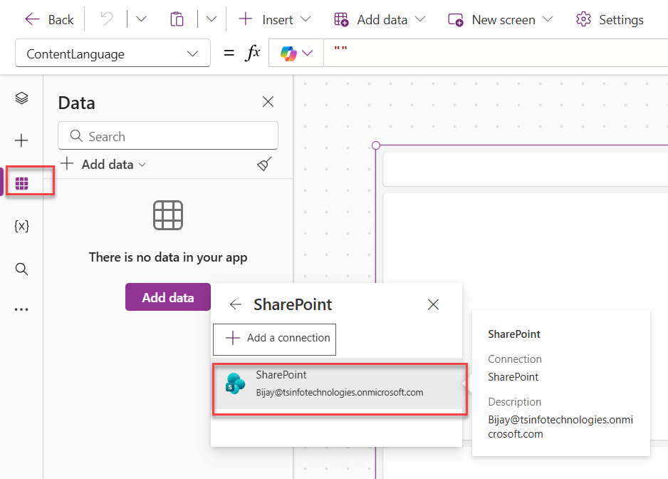
Once the app is created, add a SharePoint data source to add the Sales Tracker list into the canvas app.
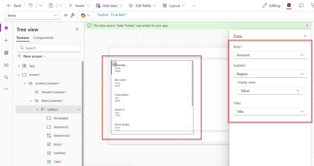
Next, add a Power Apps vertical gallery control to the Body container of the canvas app, then choose the Sales Tracker data source. Here I choose the layout of the gallery as: Title, subtitle, and body. Based on this, I choose which columns to display. You can see the screenshot below:
Method 1 – Use the Gallery’s Transition Property
This is the fastest built-in option, and it works well when you just want a simple “pop” or “push” motion without touching a single formula.
Step 1: Select your gallery control
In Power Apps Studio, click on the Sales Tracker gallery in the Tree view on the left, or click directly on the gallery in the canvas.
Step 2: Open the Transition property
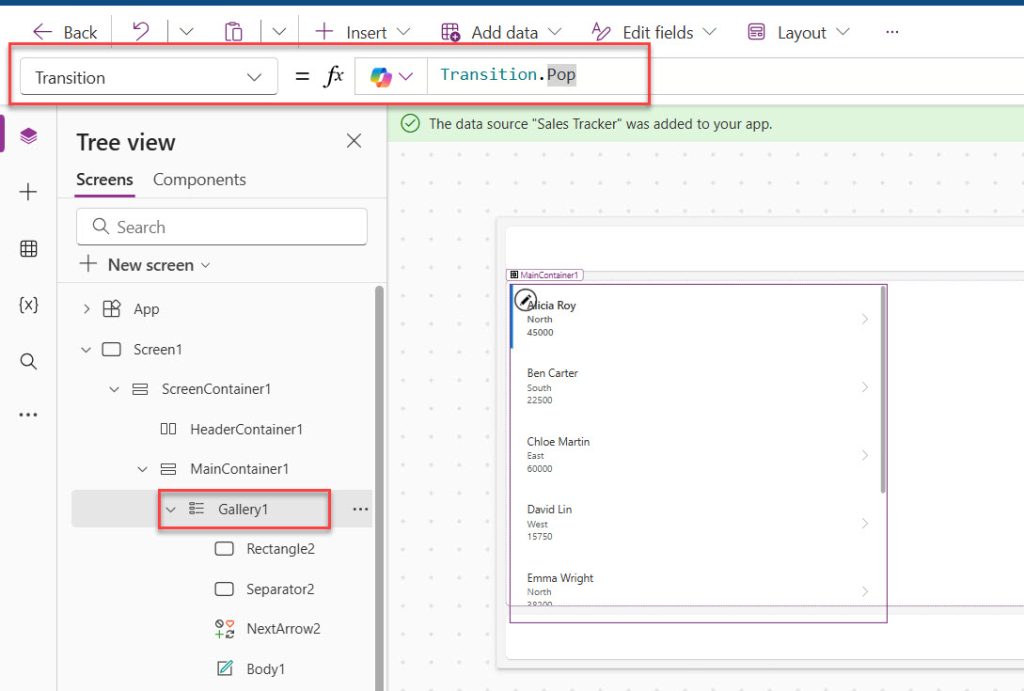
Go to the Properties panel on the right side of the screen. Look for the Transition dropdown — it’s set to None by default.
Transition = Transition.Pop
You can see the properties I set for the gallery control in the screenshot below:
How does this formula work?
This isn’t really a formula — it’s a property setting. Pop makes the item lift outward when the mouse hovers over it, while Push makes the item press inward slightly. Power Apps applies this animation automatically to every row in the gallery, so you don’t need to configure each item individually.
Step 3: Test the effect
Click Preview (F5) or press Alt and hover your mouse over different rows in the Sales Tracker gallery to see the pop or push motion in action.
Pro Tip: The Transition property only affects motion, not color. If you want a color change alongside the animation, combine this method with Method 2 below.
Method 2 – Change Background Color with HoverFill on a Button
This method works best when you want a solid color highlight behind each row, similar to how table rows highlight in Excel. It’s the most requested hover effect in the Power Apps community.
Step 1: Add a transparent button as the top layer
Inside the gallery template, go to Insert → Button. Resize it to cover the entire row and move it to the top layer using Reorder → Bring to Front. Right-click the control to see the output. Ensure you add a classic button control.
Step 2: Set the button’s size to match the template
Height = Parent.TemplateHeight
Width = Parent.TemplateWidth
How does this formula work?
Parent refers to the gallery template that holds this button. TemplateHeight and TemplateWidth are built-in properties that return the exact size of one gallery row. Setting the button to match ensures the hover effect covers the whole row, not just part of it.
Step 3: Make the button transparent and set HoverFill
Fill = RGBA(0, 0, 0, 0)
HoverFill = RGBA(0, 120, 212, 0.15)
BorderThickness = 0
How does this formula work?
RGBA sets a color using Red, Green, Blue, and Alpha (transparency) values. Setting Fill to fully transparent (Alpha = 0) means the button is invisible until the mouse hovers over it. HoverFill only activates during a mouse hover and shows a soft blue tint at 15% opacity, so the rows behind it — like SalesRep and Amount — remain fully visible.
Step 4: Route clicks through the button
OnSelect = Select(Parent)
How does this formula work?
Since the button now sits on top of every control in the row, it intercepts all clicks. Select(Parent) tells Power Apps to trigger the gallery’s own OnSelect logic when the button is clicked, so you don’t lose your existing click behavior.
Pro Tip: Hover effects only apply to the item currently under the mouse cursor — Power Apps does not let you trigger hover states on other rows at the same time.
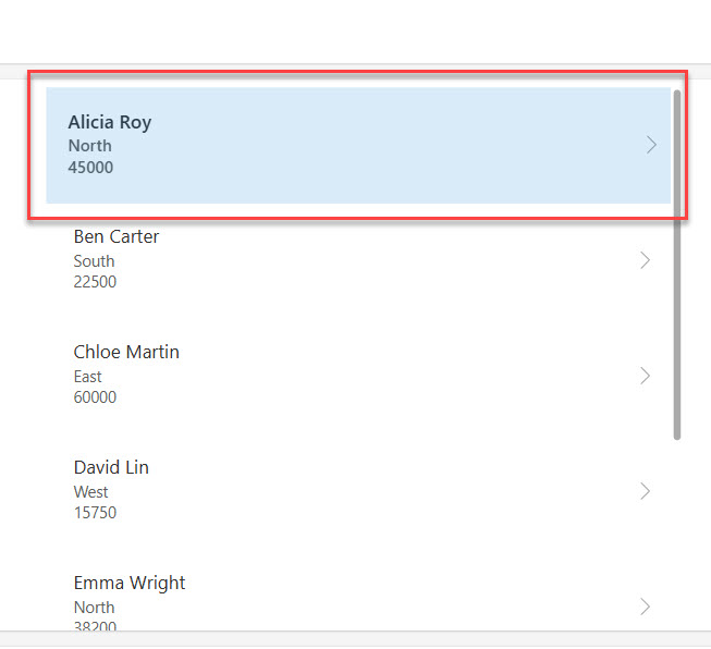
Now, when I preview the app and hover the Power Apps gallery item, you can see how the hover color is appearing like in the screenshot below:
Check out How to Set Control Value in Button Click on Power Apps?
Method 3 – Highlight Selected and Hovered Items with Conditional Formatting
This method is suitable for scenarios where you need to show both a hover state and a permanently selected state, such as allowing a manager to click a sales rep’s row and keep it highlighted.
Step 1: Add a background rectangle inside the template
Go to Insert → Shapes → Rectangle inside the gallery template and place it behind the text controls.
Step 2: Set its Fill property with an If function
Fill = If(ThisItem.IsSelected, ColorFade(Color.RoyalBlue, 0.7), Color.White)
How does this formula work?
ThisItem.IsSelected checks whether the current row is the one the user selected. If returns one color when true and another when false. ColorFade lightens RoyalBlue by 70%, creating a soft highlight instead of a harsh solid color.
Step 3: Layer a transparent button for the hover state
Repeat the button setup from Method 2, but set its HoverFill to a lighter shade than the selected color so users can visually tell hover and selected states apart.
HoverFill = If(ThisItem.IsSelected, ColorFade(Color.RoyalBlue, 0.7), ColorFade(Color.LightGray, 0.5))
How does this formula work?
This nested If makes sure a row that’s already selected doesn’t visually “flicker” to a different color on hover — it keeps the selected look, while unselected rows show a light gray hover tint.
Pro Tip: Avoid using bright, high-contrast HoverFill colors on Status columns with existing conditional formatting (like red for “Overdue”) — the hover tint can make status colors hard to read.
Check out Power Apps Switch Function
Method 4 – Apply Hover Effects to Icons and Labels Individually
Use this method when you want only specific elements — like a Status icon or Amount label — to react on hover, rather than the entire row.
Step 1: Select the individual control
Click on the specific label or icon inside the gallery template, such as the Amount label.
Step 2: Set its HoverColor or HoverFill property directly
HoverColor = Color.DarkBlue
HoverFill = RGBA(255, 255, 255, 0.1)
How does this formula work?
Most modern controls in Power Apps, including labels, icons, and buttons, expose HoverColor (text color on hover) and HoverFill (background color on hover) as native properties. You don’t need a button overlay here because the control itself supports hover states directly.
Pro Tip: Plain Text Label controls without a Fill property (transparent background labels) won’t show HoverFill visibly — pair them with a shape or button behind them if you need a visible hover background.
Read Power Apps Concatenate Strings (With Real Examples)
Things to Keep in Mind
- Gallery templates don’t support hover natively: The gallery container itself has no HoverFill property — you must use buttons, shapes, or individual controls inside the template.
- Layer order matters: If your transparent button isn’t the top layer, other controls will block the hover effect from being seen.
- Watch performance on large data sources: Adding complex If or ColorFade formulas to every row’s Fill or HoverFill can slow down rendering on large SharePoint lists or Dataverse tables with hundreds of rows.
- Delegation isn’t affected by hover formulas: Since HoverFill and Transition are visual-only properties, they don’t get delegated to the data source, but heavy nested logic still adds client-side rendering overhead.
- Test on touchscreens: Hover effects rely on mouse movement, so tablet and phone users won’t see them — always add a tap-based visual cue like IsSelected as a backup.
- Use named formulas for shared hover colors: If multiple screens use the same hover color scheme, define it once as a named formula instead of repeating RGBA values across every gallery.
Power Apps gives you four solid ways to add hover effects: the built-in Transition property for quick animations, layered buttons for full-row color highlights, conditional formatting for combined selected-and-hover states, and individual control properties for targeted effects.
For most beginners building something like a Sales Tracker gallery, start with Method 1 for a quick win, then move to Method 2 once you need real color feedback. I hope you found this article helpful.
You may also like:

Bijay Kumar is a 13-times Microsoft MVP in Business Applications with over 18 years of experience in the IT industry, recognized for his contributions to the Microsoft community. He is the Founder of TSinfo Technologies and shares practical, tested tutorials on Power Apps, Power Automate, Copilot Studio, and Power BI here on Power Platform FAQs. Read more.